On this page
The Highland Atmosphere
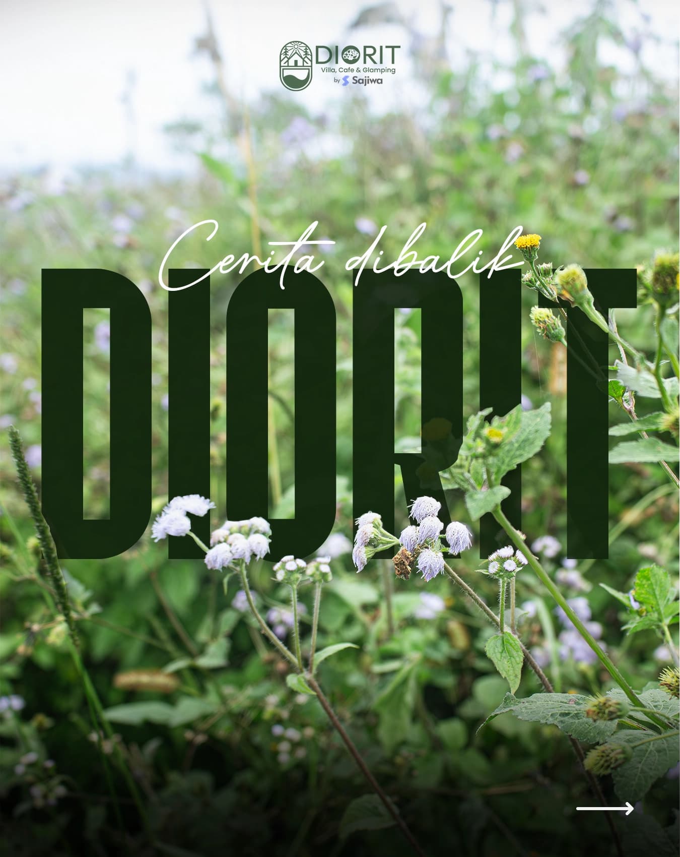
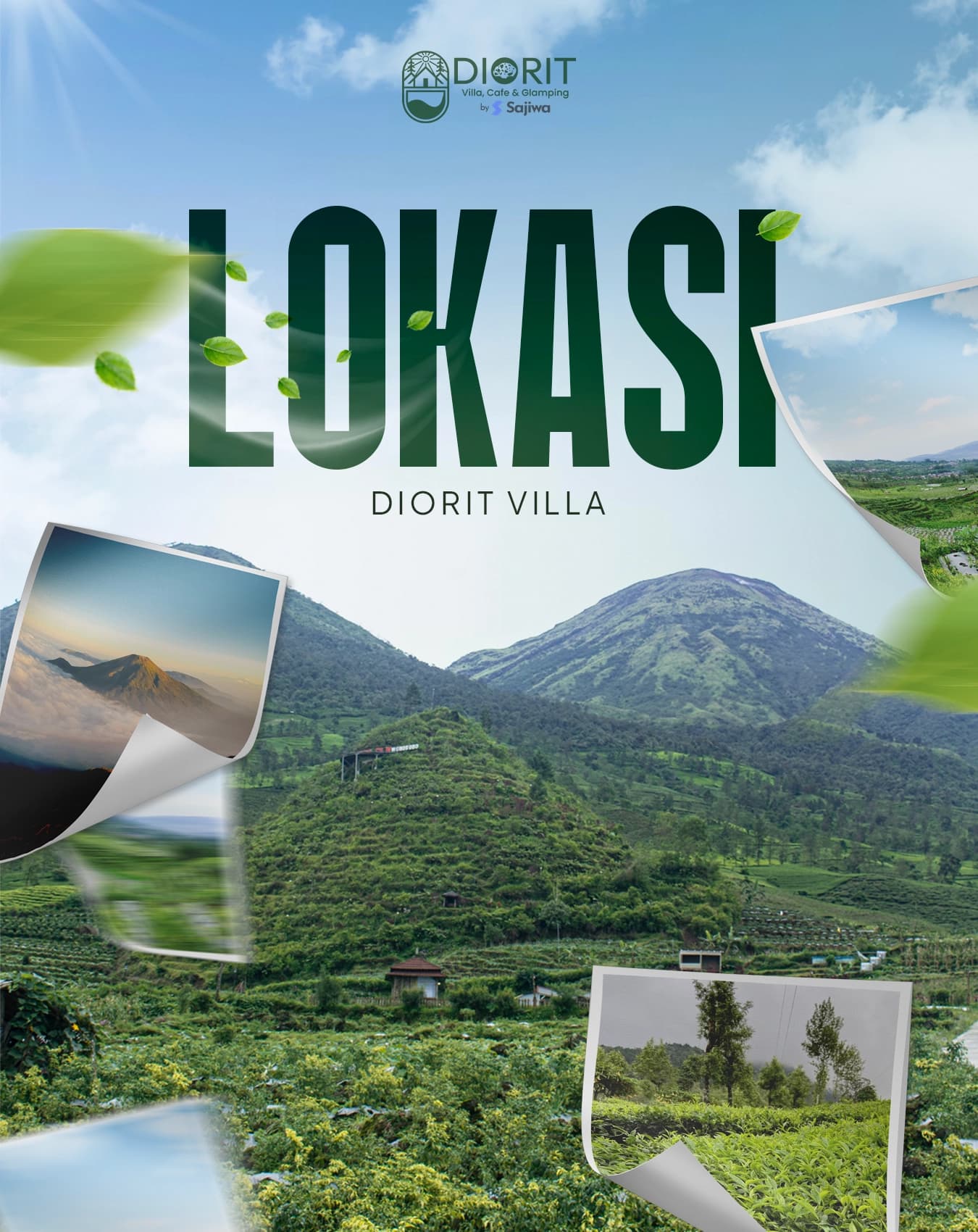
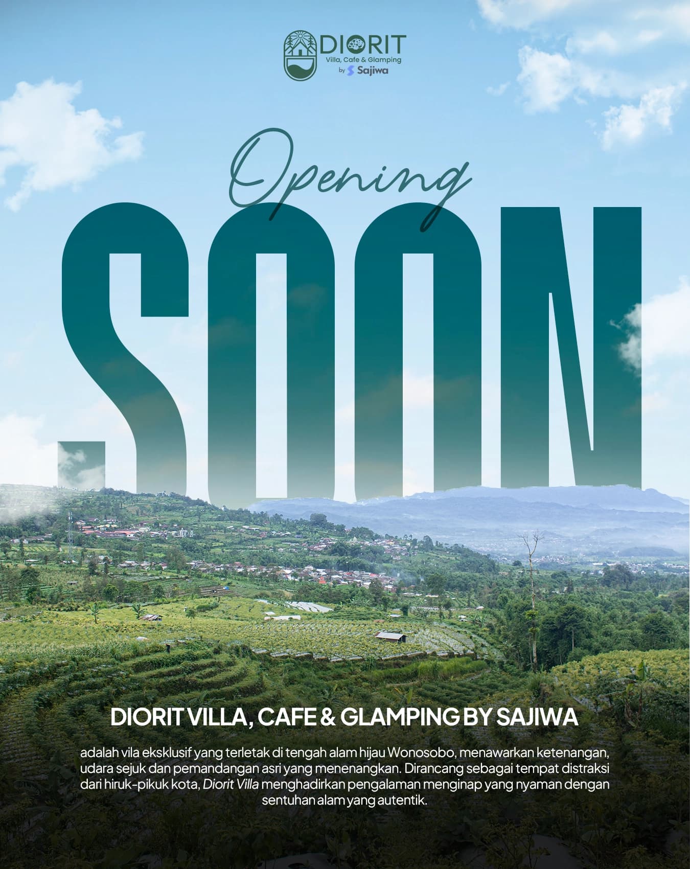
Diorit Villa, Café & Glamping is an eco-hospitality property nestled in the mountainous highlands of Dieng and Wonosobo. Surrounded by dense pine forests and terraced agricultural plantations, the property pairs elevated geometric A-frame cabins with an on-site specialty café.
I was brought on to deliver an end-to-end creative package: establishing the resort's visual identity, producing its on-property print materials, and engineering its responsive marketing website. The central design challenge was atmospheric translation—capturing the quiet, misty serenity of highland hospitality across both physical touchpoints and a digital screen.
Brand Identity & Physical Touchpoints
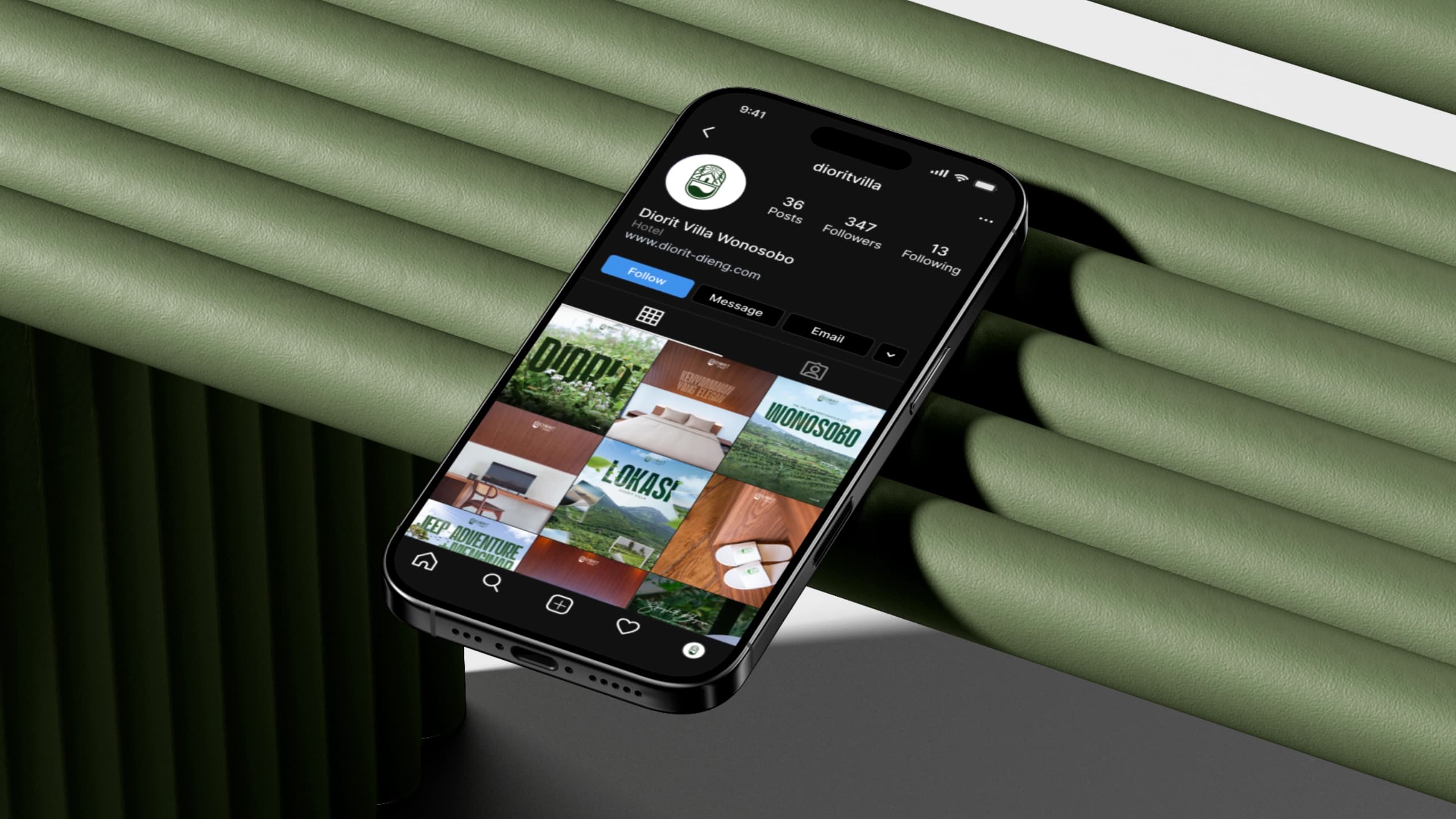
Starting from an arched architectural emblem reflecting the resort's iconic rooflines, I developed a grounded visual language built on an organic palette: deep pine forest green, warm stone, and off-white neutrals.
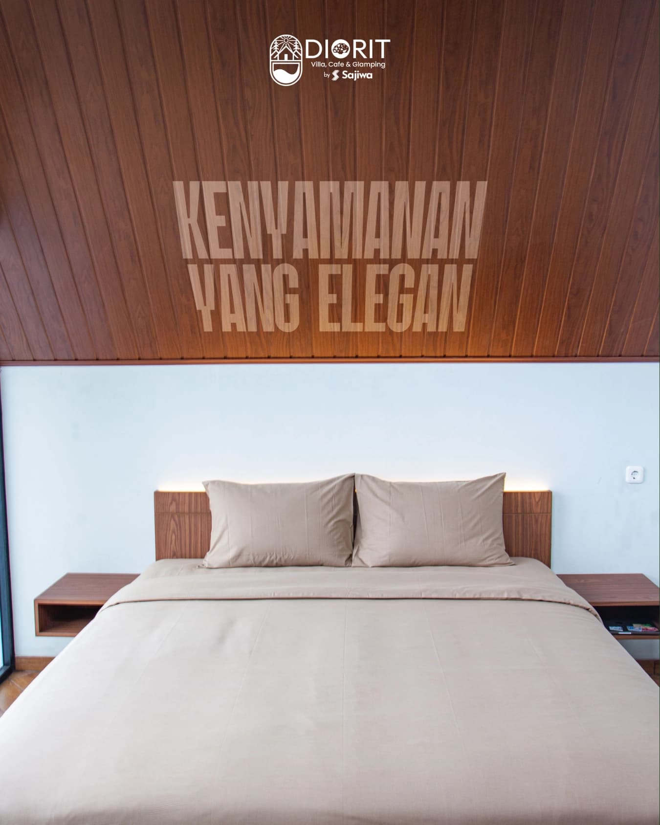
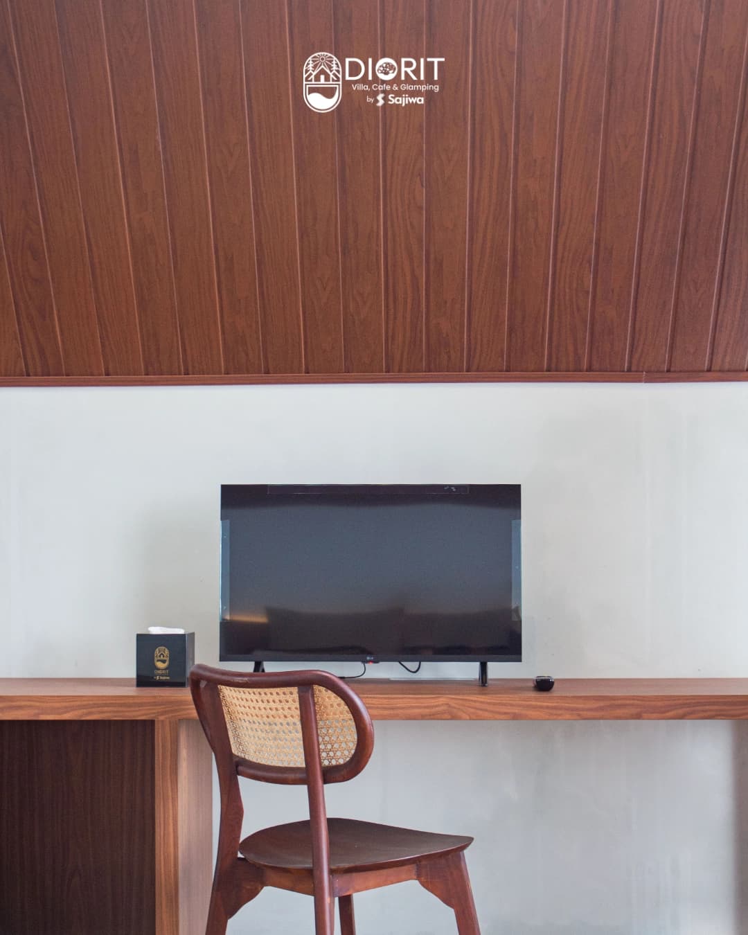
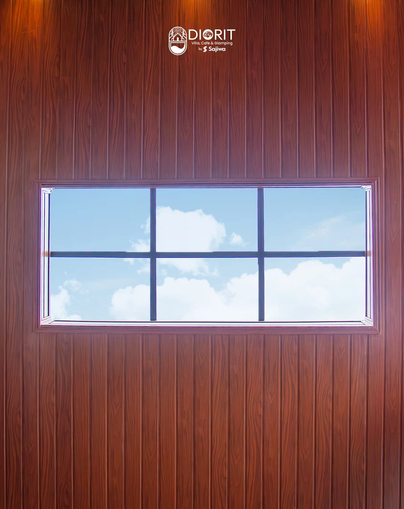
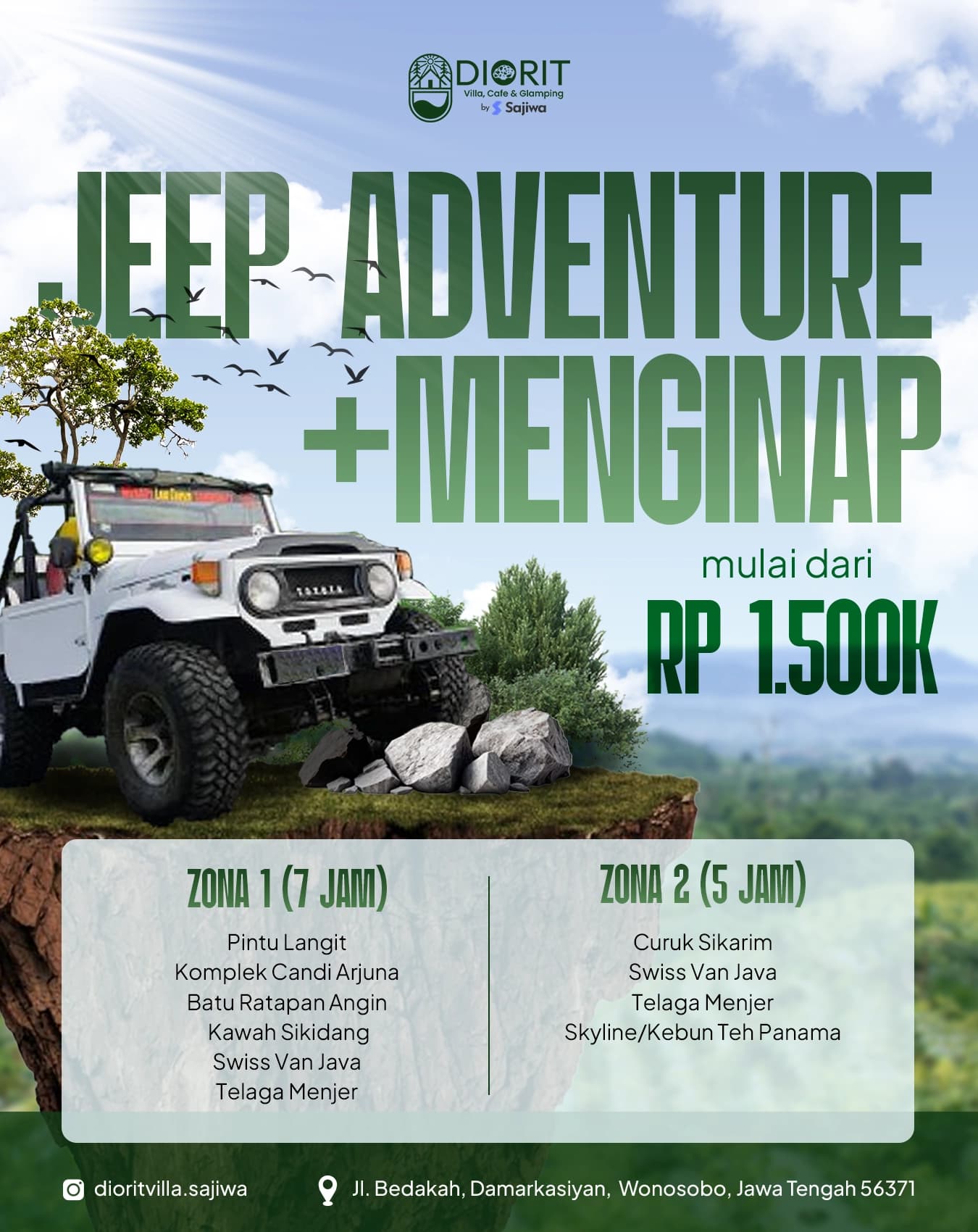
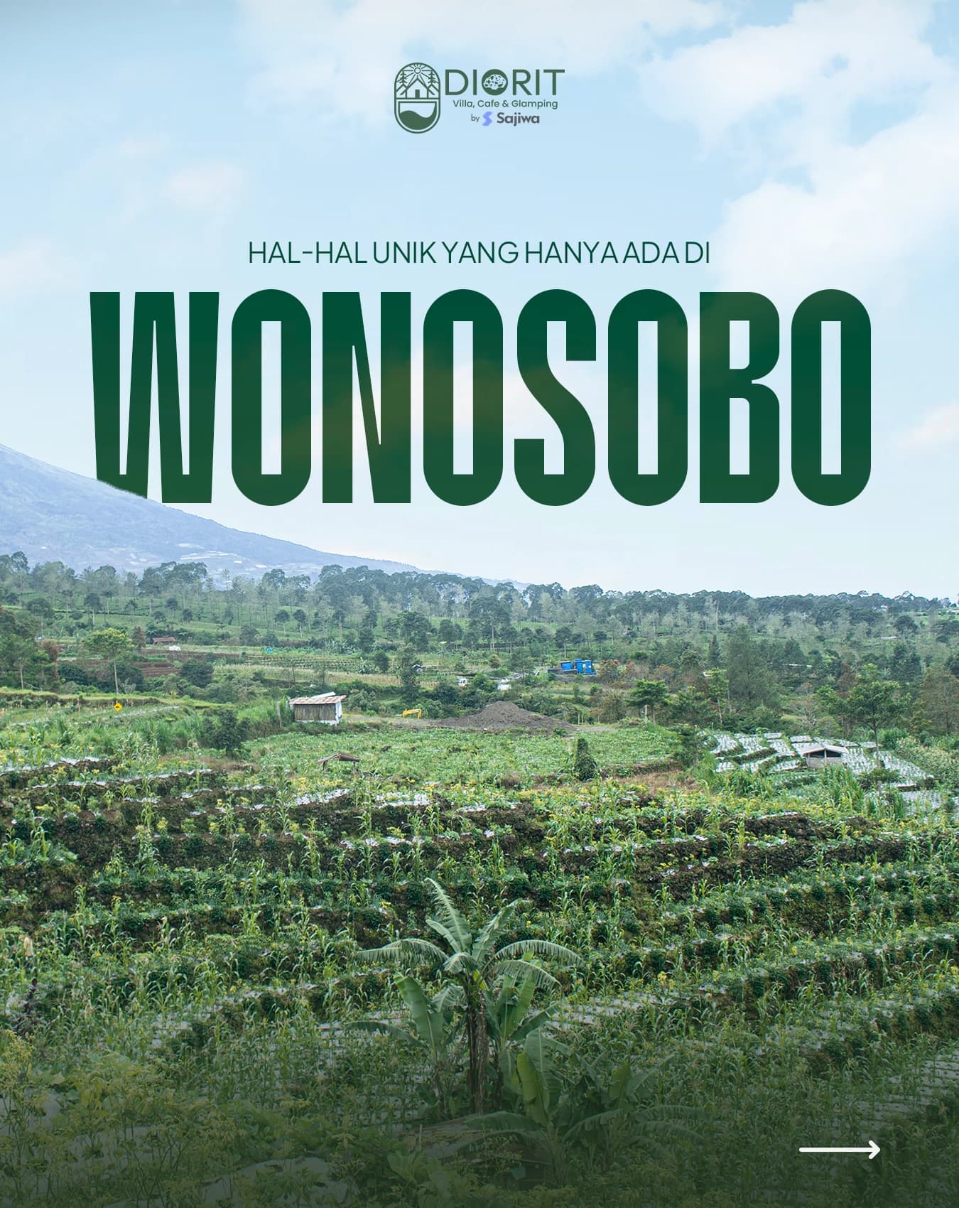
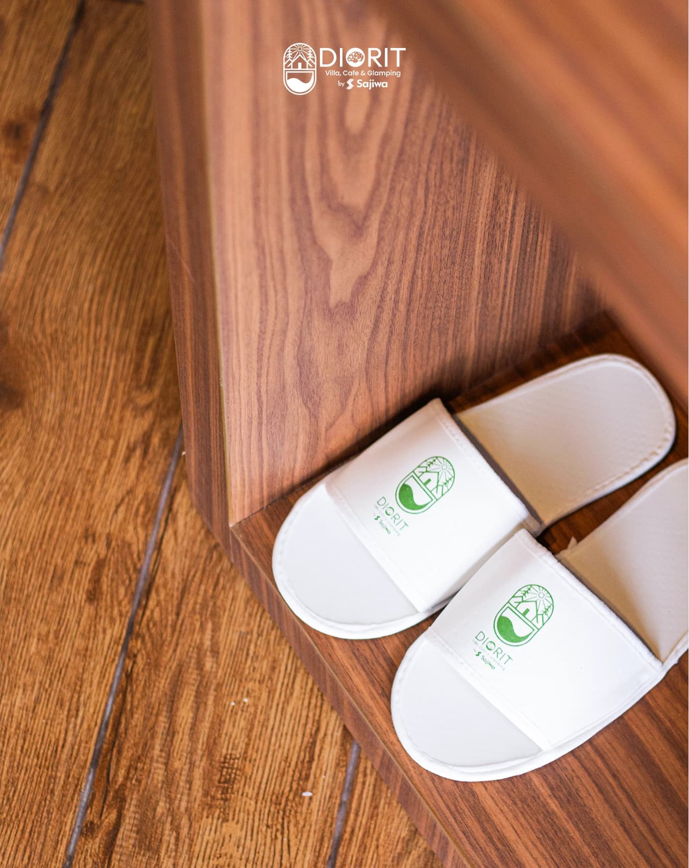
Hospitality experiences are felt in the physical details. Beyond digital assets, I directed an on-site photography shoot to capture the interplay of natural daylight against vaulted wooden ceilings and panoramic plantation views. For on-property guest operations, I designed the complete suite of tactile collateral: villa rate cards, welcome vouchers, property information brochures, table tent cards, seasonal drink menus, and outdoor directional signage.
Component Hierarchy & Spatial Collage
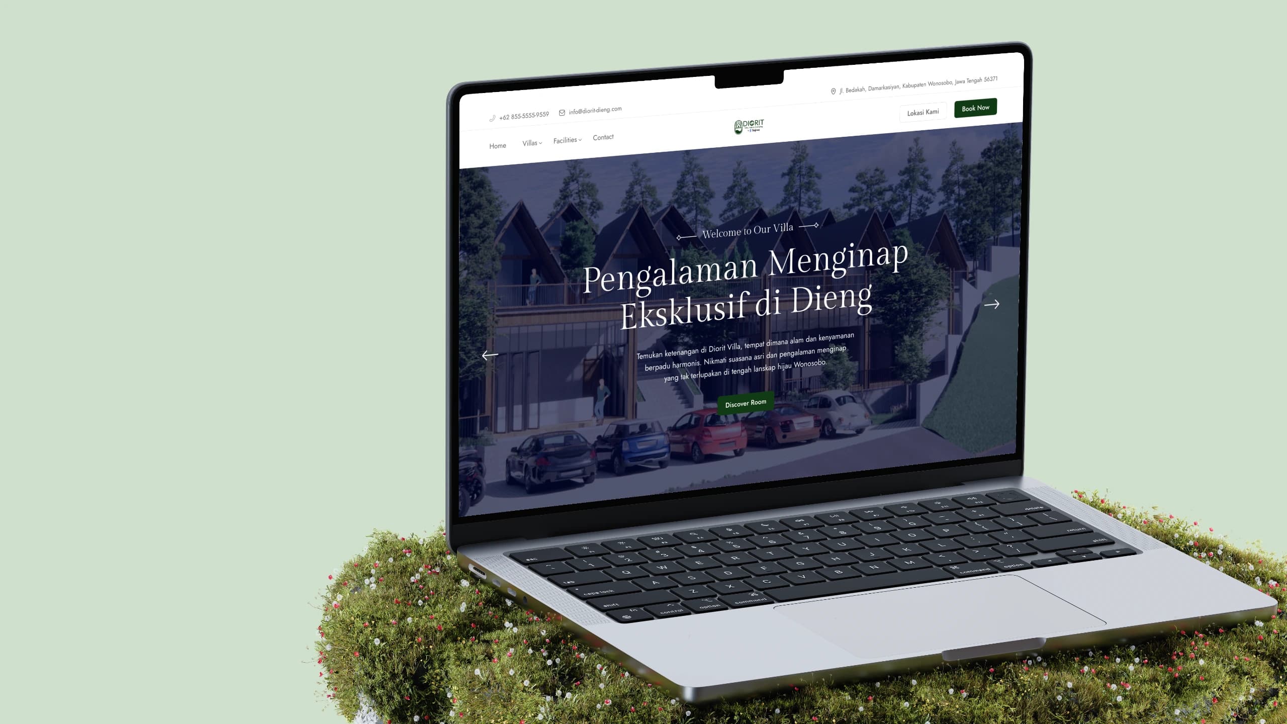
The digital experience was built in React to serve as the visual showcase for prospective travelers. Rather than relying on rigid, cookie-cutter hotel grids, the interface utilizes asymmetrical spatial collages that mirror the layered elevation of the Dieng hillside.
In the narrative section, a wide panoramic shot of the Wonosobo tea plantations sits beside an overlapping portrait frame of a vaulted villa interior, accented by a floating room-inventory counter. Below the fold, an interactive room carousel displays distinct cabin categories—from single cabins to family suites—with standardized metadata for room dimensions (35 sqm) and guest capacity (2 Person) rendered directly over high-resolution photography.
Typography & Low-Friction Conversion
The typography relies on an intentional balance between classical elegance and modern utility. Major display headlines use an expressive, high-contrast serif that conveys architectural dignity, while navigation bars, room specs, and contact coordinates rely on a clean, legible sans-serif.
For a remote mountain retreat, booking friction must be close to zero. Prospective guests frequently need immediate geographic reassurance and fast direct communication channels. The persistent top utility bar embeds exact mountain road coordinates, direct phone lines, and a dedicated location button linking to navigation maps. Paired with prominent booking action triggers in the hero banner and navigation rail, the site converts browsing wanderlust into confirmed guest reservations while preserving its serene, unhurried visual tone.
Where it stands.
Delivered
- End-to-end brand identity mark, typography rules, and color palette.
- On-property physical collateral: rate cards, tent cards, vouchers, and wayfinding signage.
- On-site architectural and interior photography art direction.
- Responsive React landing page featuring room carousels and direct booking integration.
What remains
- Room availability verification and direct bookings redirect to the property's dedicated reservation channels.