On this page
Day One at the Table
I joined Satujiwa at the exact moment the company was founded, sitting in its very first boardroom meeting. On paper, my official title read IT & Digital Marketing Manager. In reality, the most technical thing I did was deploying an initial WordPress marketing site; virtually all my screen time was spent inside Illustrator and Photoshop as a solo founding designer.
We started with a clean slate: zero visual assets, no established palette, and no documentation. As the sole creative in the room, I took complete ownership of how this hospitality venture would present itself to the world. That meant moving beyond making pretty logos to designing a living visual system that had to serve two masters simultaneously: corporate hospitality management and daily on-the-ground guest operations.
Holding Architecture and Property Localization
The primary brand challenge was architectural. Satujiwa was not a single standalone boutique; it was an umbrella management company overseeing a portfolio of distinct properties across Indonesia.
I had to establish a clear hierarchy between the parent holding brand and the individual hotels under management. The holding identity required an understated, professional posture suitable for business partnerships, asset owners, and investor decks. The individual properties, however, required distinct visual personalities tailored to their local urban or resort character.
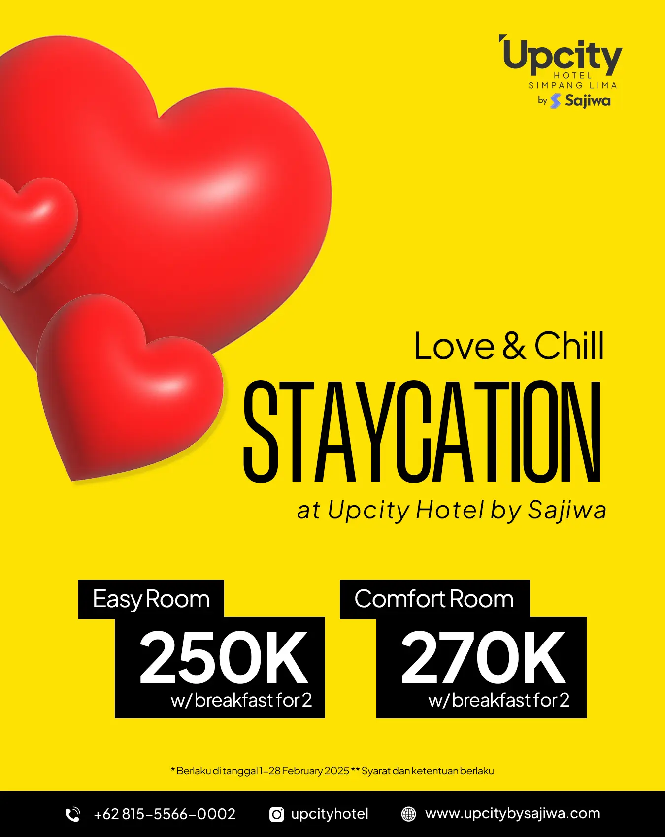
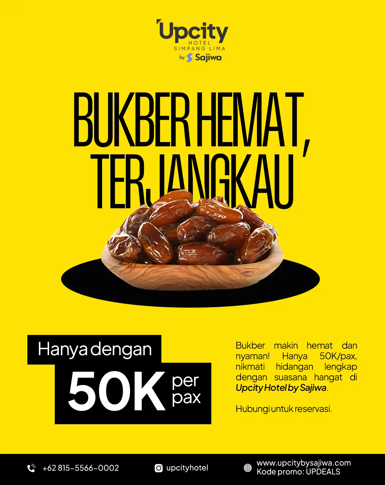
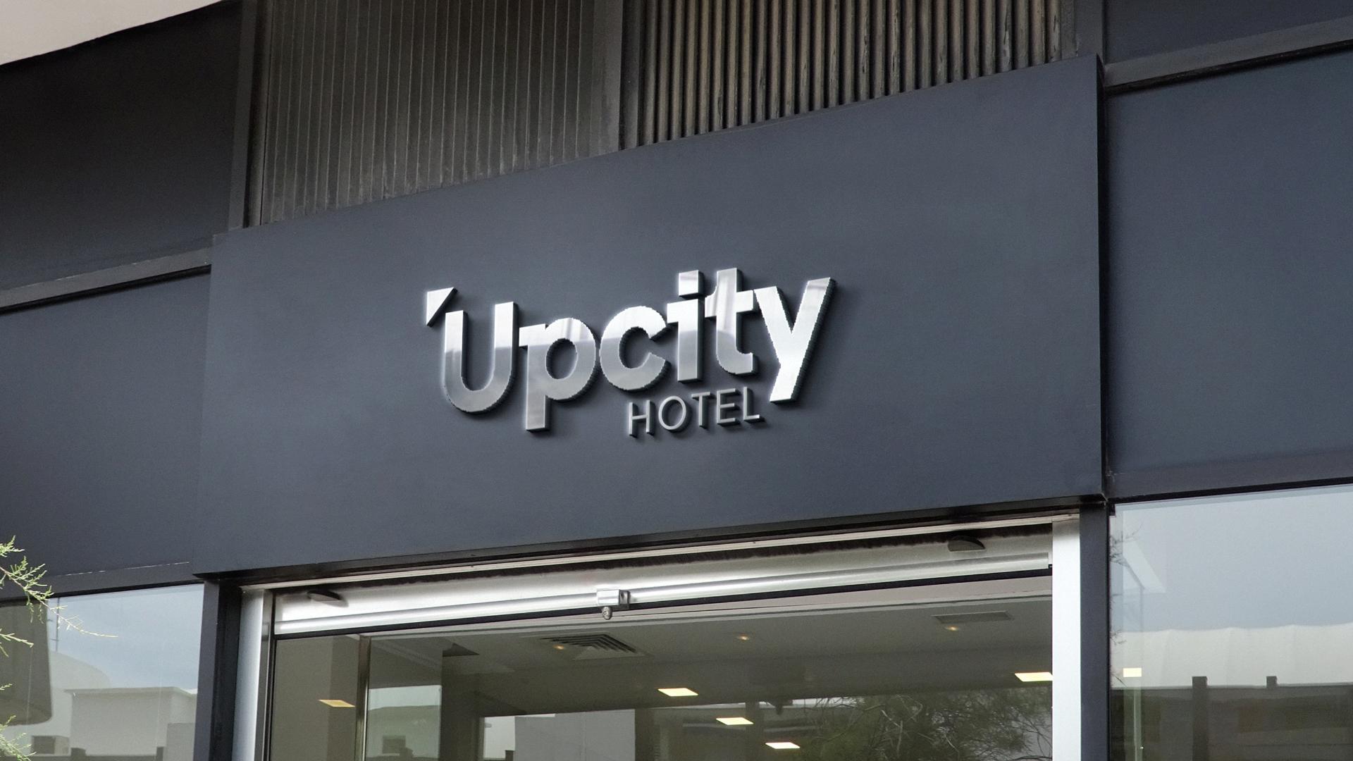
A primary example of this multi-tier architecture was Upcity Hotel, a modern urban property under the Satujiwa umbrella. Rather than forcing a cookie-cutter corporate template, I created Upcity's original identity mark from the ground up—designing a clean, geometric wordmark paired with high-contrast signage templates and a tailored urban palette. This proved the flexibility of the core system: each managed hotel could express its own local identity while remaining anchored to the parent group’s spatial grid, typography scale, and quality standards.
Multi-Channel Campaigns and Environmental Print
Hospitality design is unique because digital impressions eventually meet physical, three-dimensional reality. Over my tenure, I operated as a one-person creative department managing touchpoints across both digital feeds and brick-and-mortar hotel corridors.
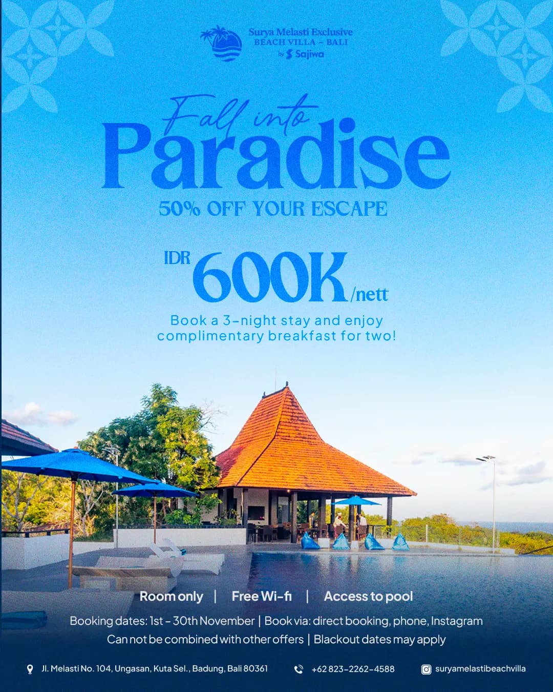
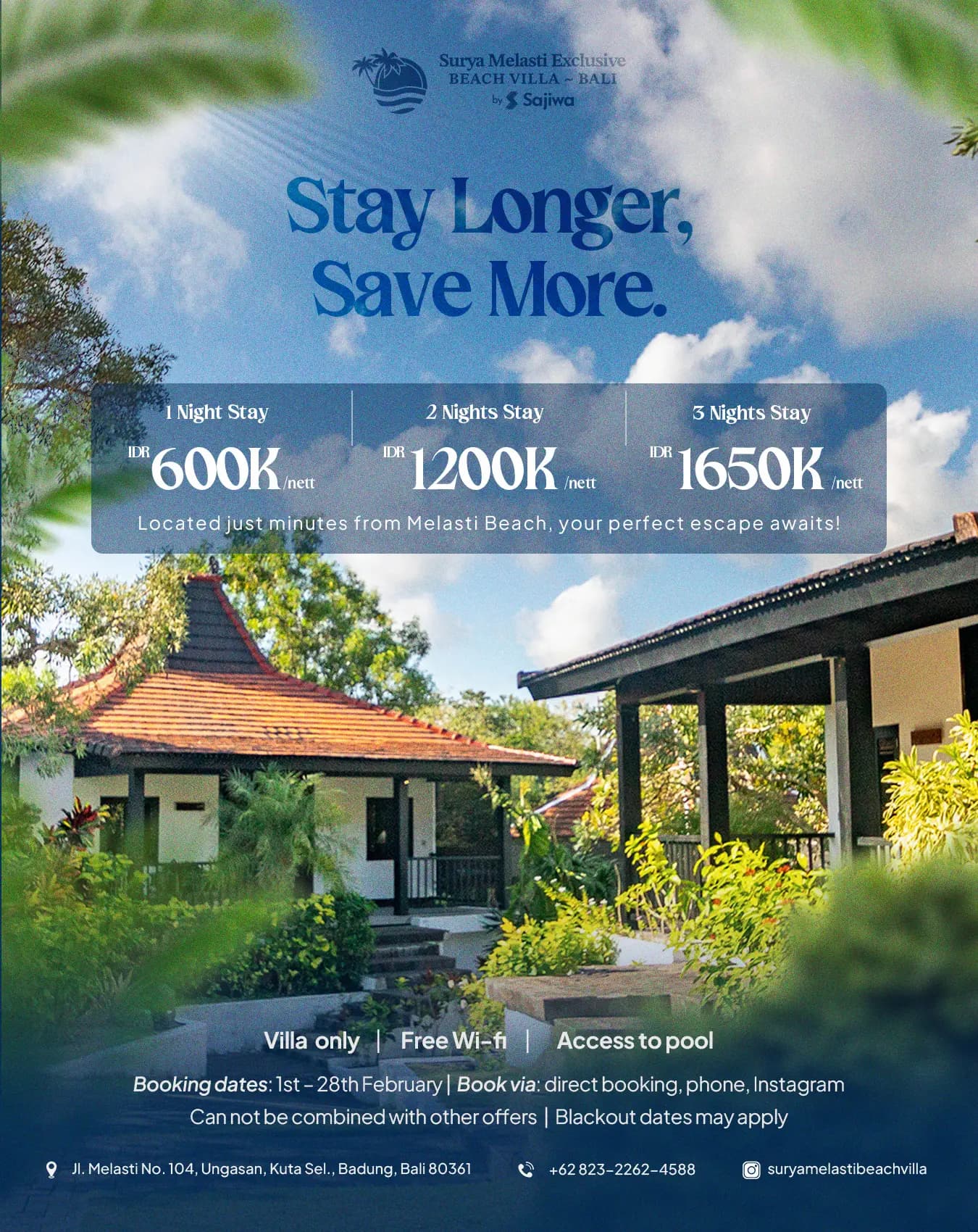
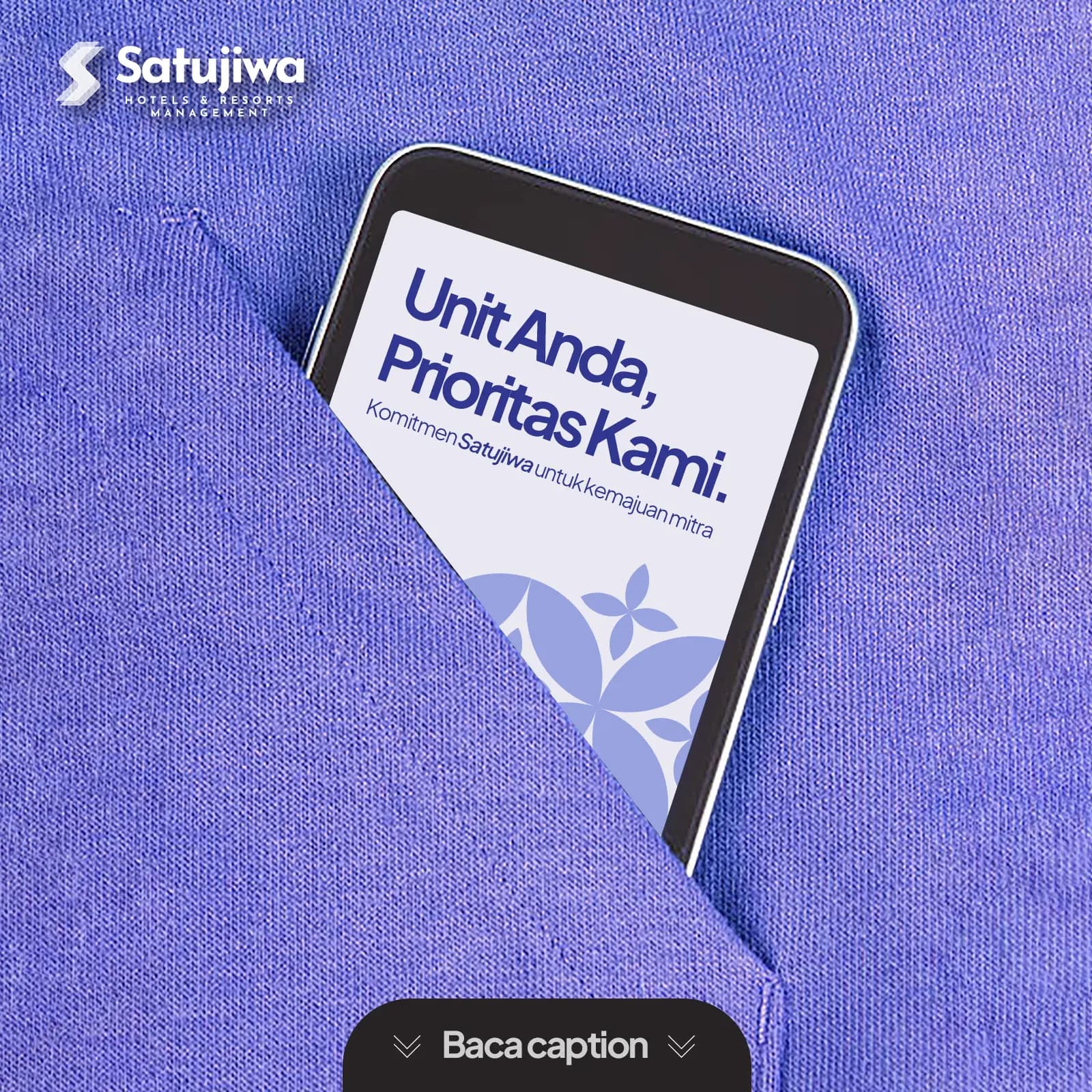
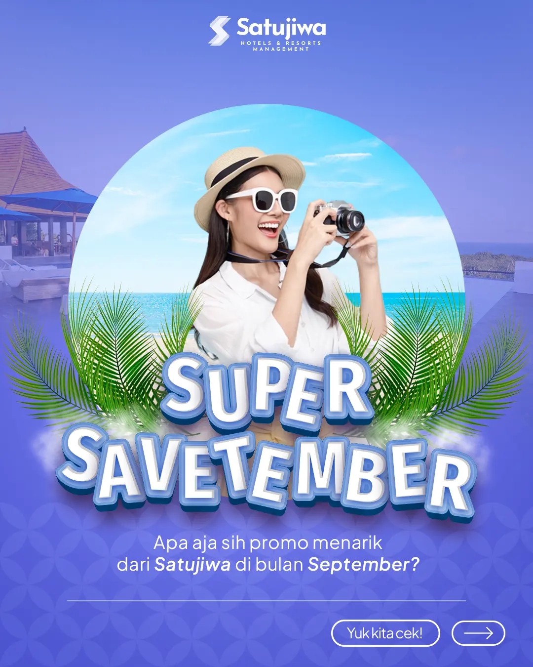
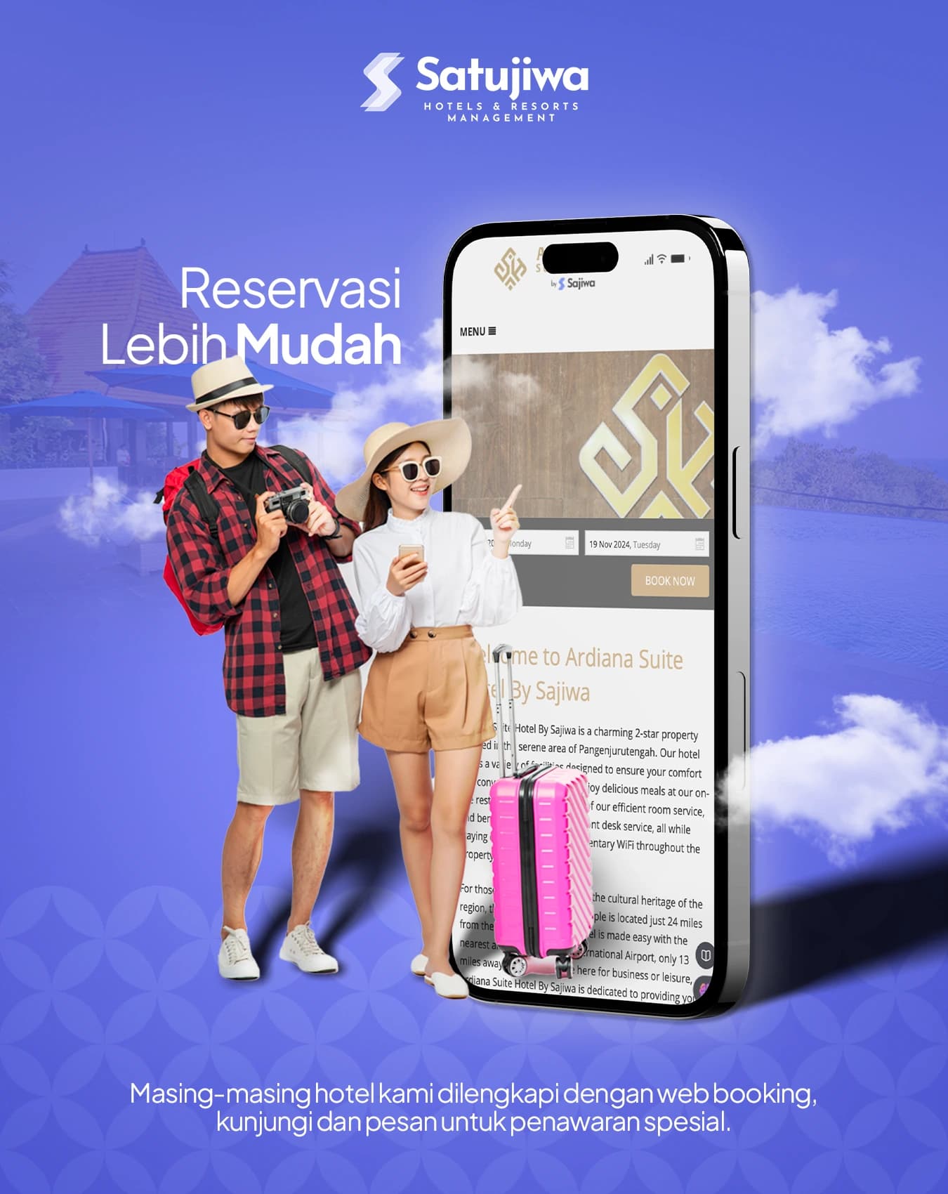
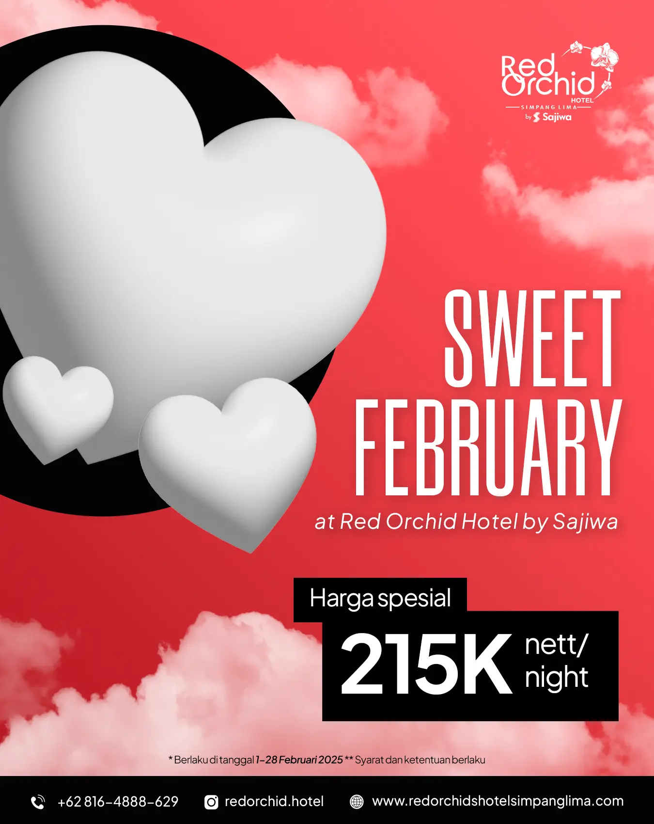
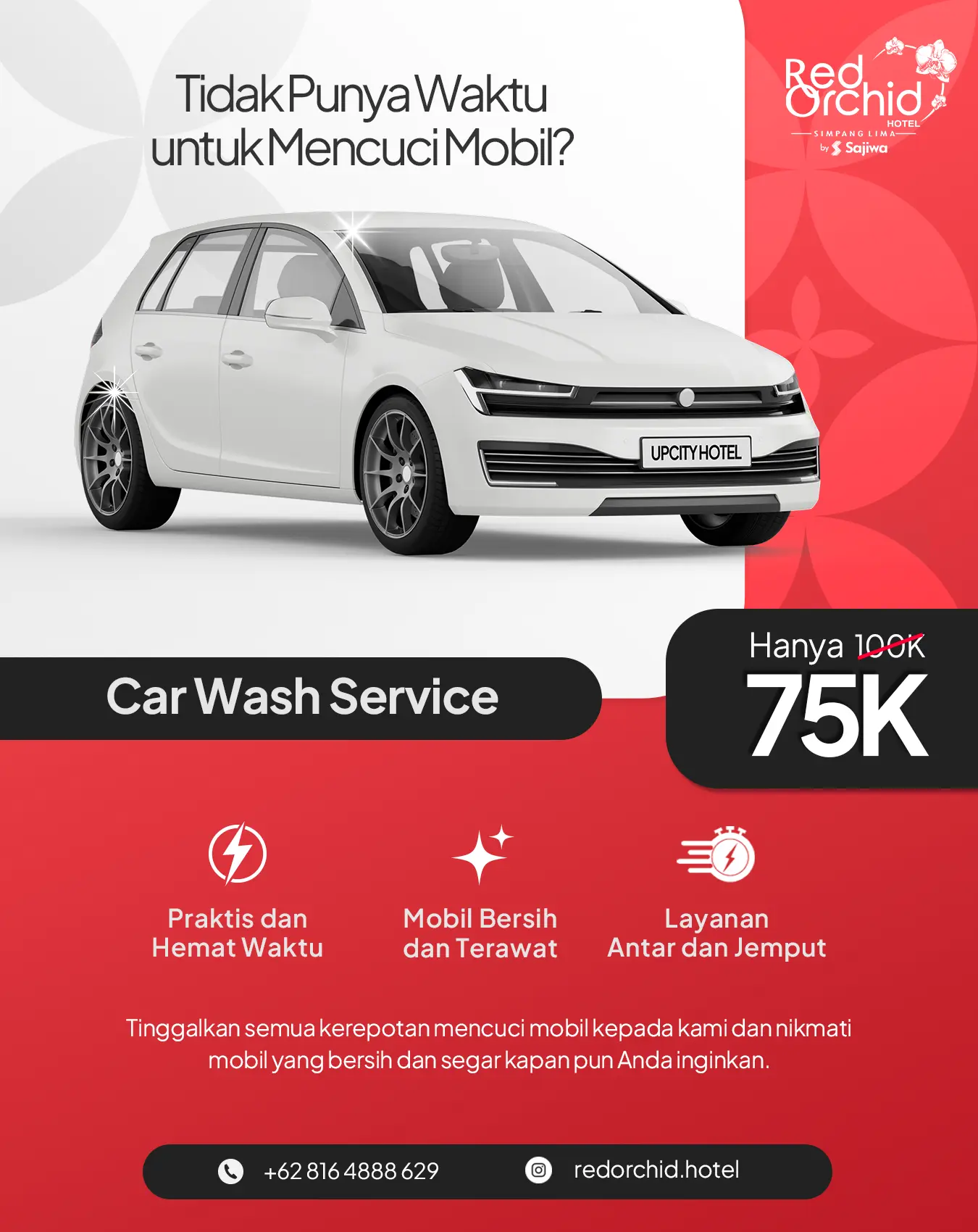
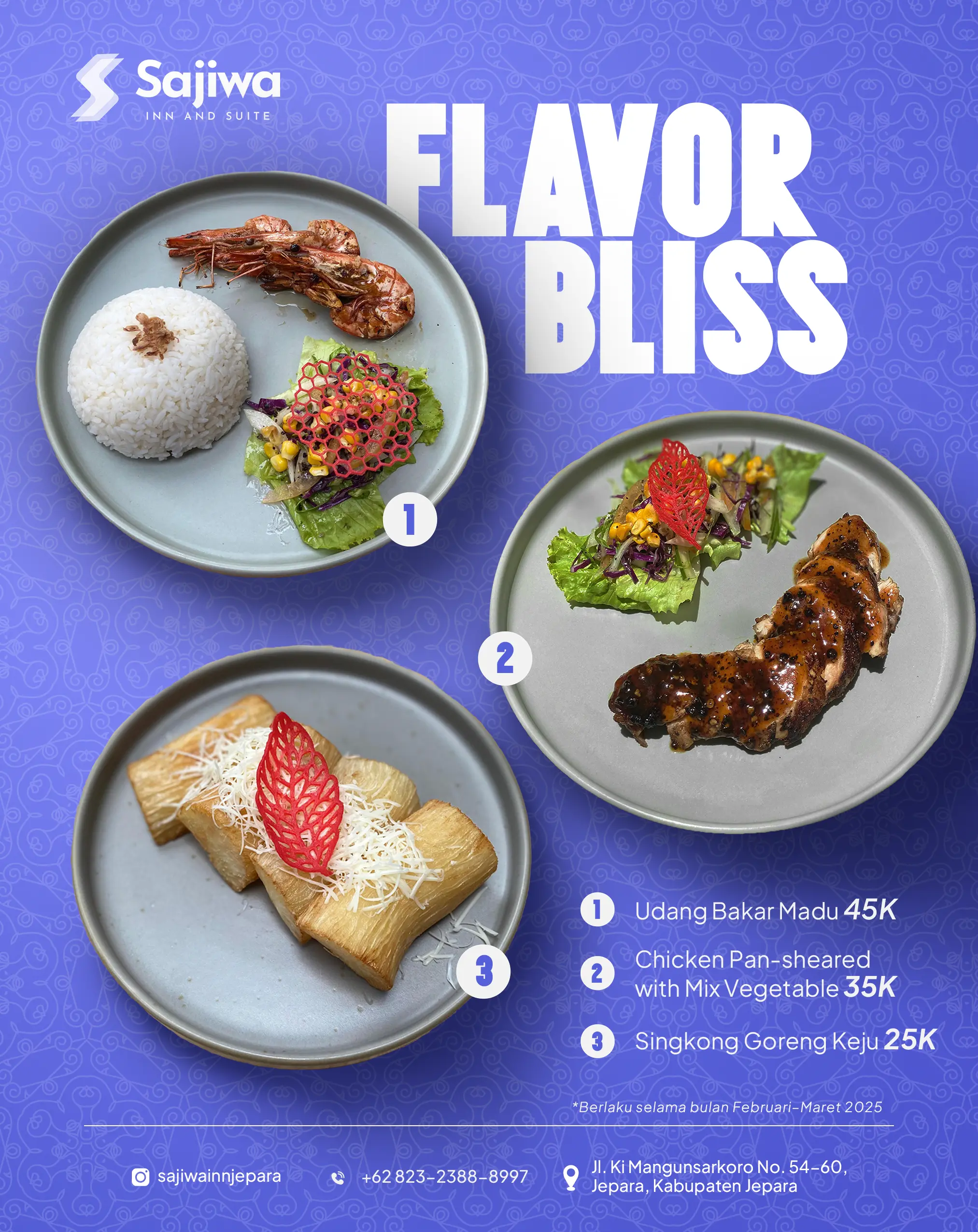
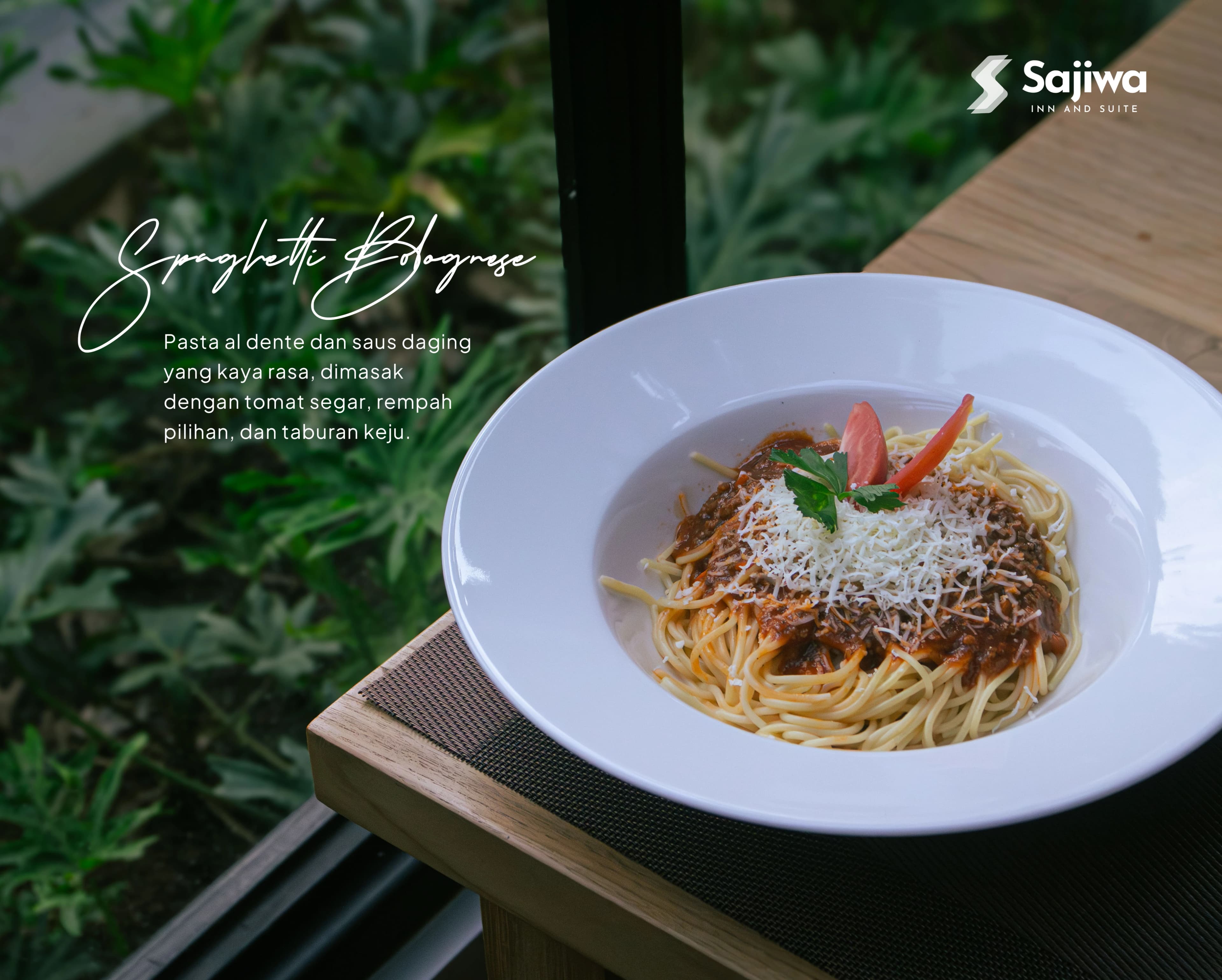
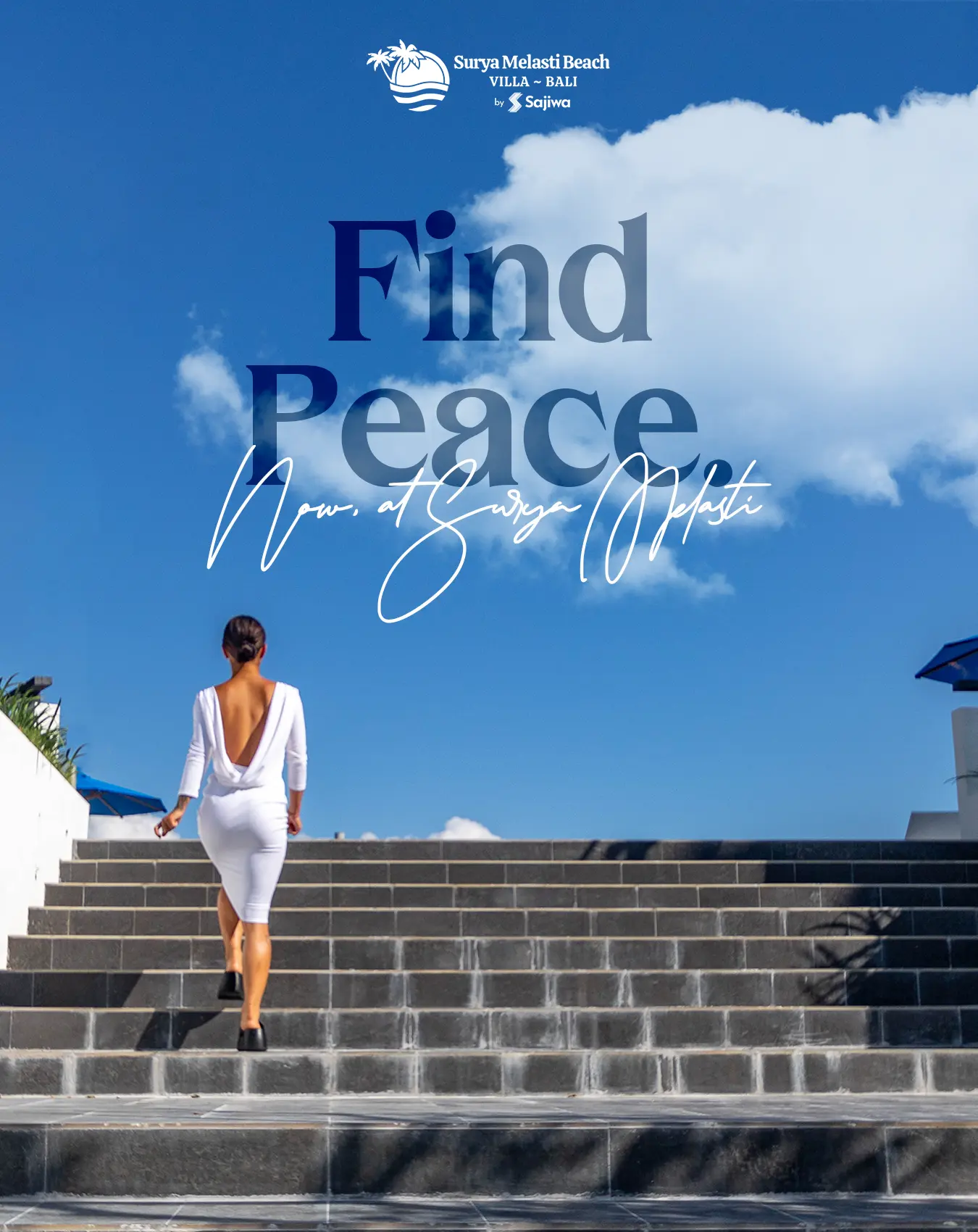
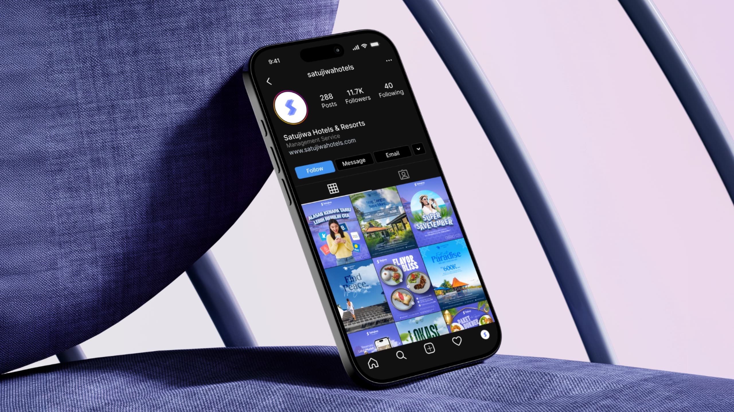
On the digital front, I built reusable template systems in Photoshop and Illustrator for monthly promotional campaigns, holiday packages, café menus, and social media releases across Instagram and TikTok. Defining modular layouts allowed the team to produce fast marketing variations across ten hotel properties without fragmenting the brand look.
In the physical realm, I designed the tactile environmental collateral that guests directly interacted with during their stays. This spanned exterior building banners, lobby wayfinding signage, room key cards, door hangers, property maps, and guest directories. Designing for print demanded rigorous vendor management: preparing color-calibrated CMYK files, defining precise bleed margins, and specifying durable paper stocks and matte laminations so materials stayed pristine through months of heavy guest handling.
The Living Brand Bible and Continuity
Because I was a solo designer responsible for hundreds of assets across multiple properties, the greatest operational risk was long-term consistency. What would happen to the brand once I was no longer the one opening the design files every morning?
To solve this, I authored a comprehensive brand guidebook that documented every rule of the visual system: logo clearspace, spatial grid ratios, typography hierarchies, photography art direction, and exact CMYK color formulas for print vendors. Crucially, the guidebook established clear boundaries between what was fixed (core marks, grid proportions, typographic weights) and what was flexible (property accent colors, localized event graphics).
Instead of gathering dust as an abstract slide deck, this manual became an active operational bible across departments. Front-desk teams referenced it when reordering keycards, local marketers consulted it when drafting seasonal promotions, and external print shops used its file-naming and export specs. Long after I completed my full-time role at Satujiwa, the guidelines continue to govern the company's visual output, keeping the group's identity cohesive across every new property it acquires.
Where it stands.
Delivered
- Core brand identity and logomark suite for Satujiwa corporate holding.
- Sub-property brand system and identity design for Upcity Hotel.
- Multi-channel promotional campaign templates across 10+ managed properties.
- Environmental signage, keycard sets, wayfinding, and operational print collateral.
- Comprehensive operational Brand Guidelines manual actively used by staff.
What remains
- Earlier employment creative tenure; distinct from the 2026 custom web application rebuild.