
On this page
The Consumer Fintech Shift
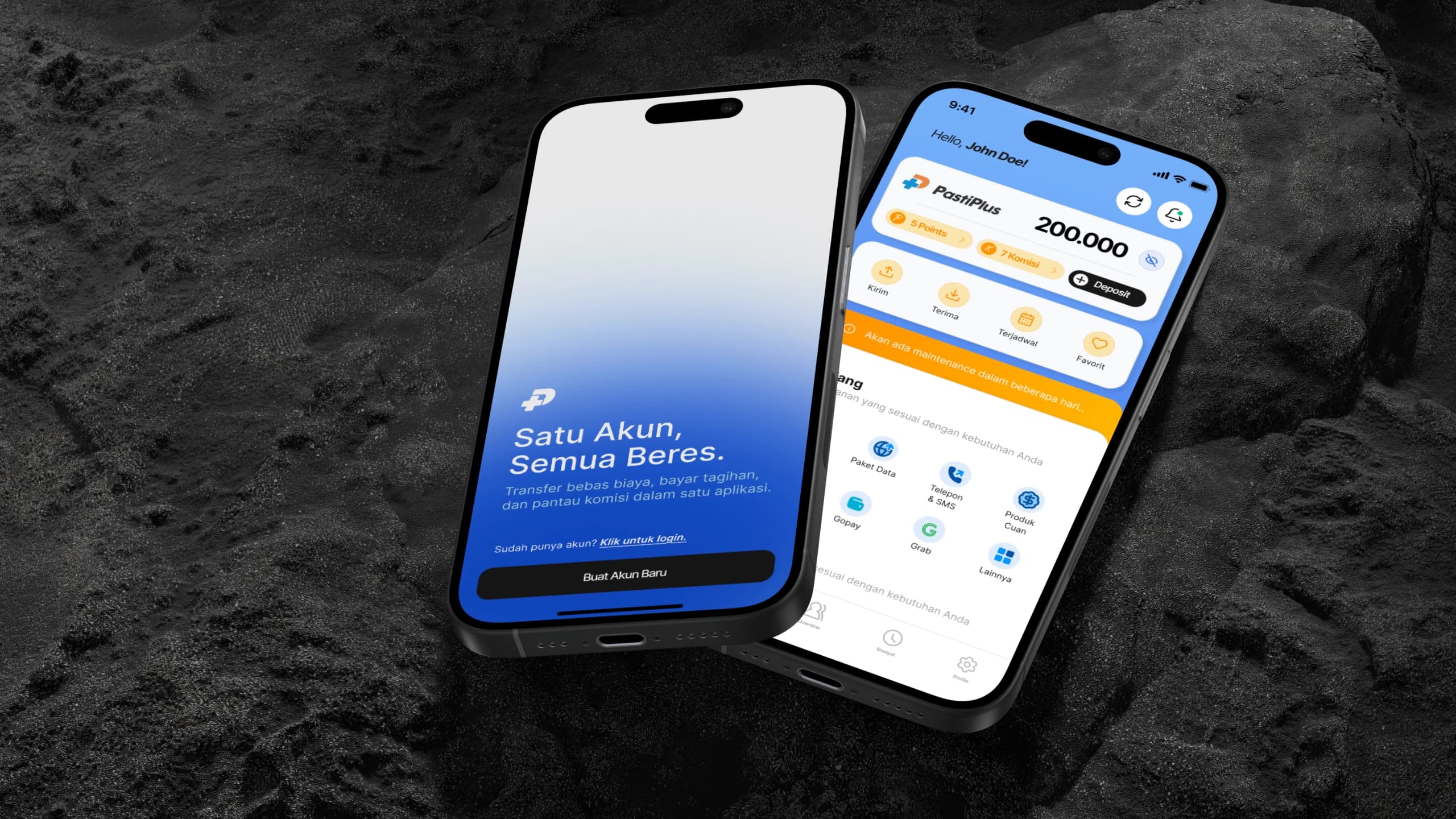
PastiPlus operated in the mobile-credit and utility payments space and wanted to expand into a consumer-facing financial application, similar to modern digital banking and e-wallet platforms like Bank Jago or myBCA. I joined the project as an independent freelance UI designer to build the entire mobile experience from the ground up.
Fintech interfaces demand an uncompromising level of visual trust and zero ambiguity. When users interact with money, every touch target, balance counter, and confirmation state must feel deliberate and stable. Starting from a blank canvas, I established the app's visual identity, typography rules, color tokens, and complete screen suite—spanning authentication, biometric sign-in, account dashboards, transaction histories, and transfer flows.
Engineering-Grade Component Systems
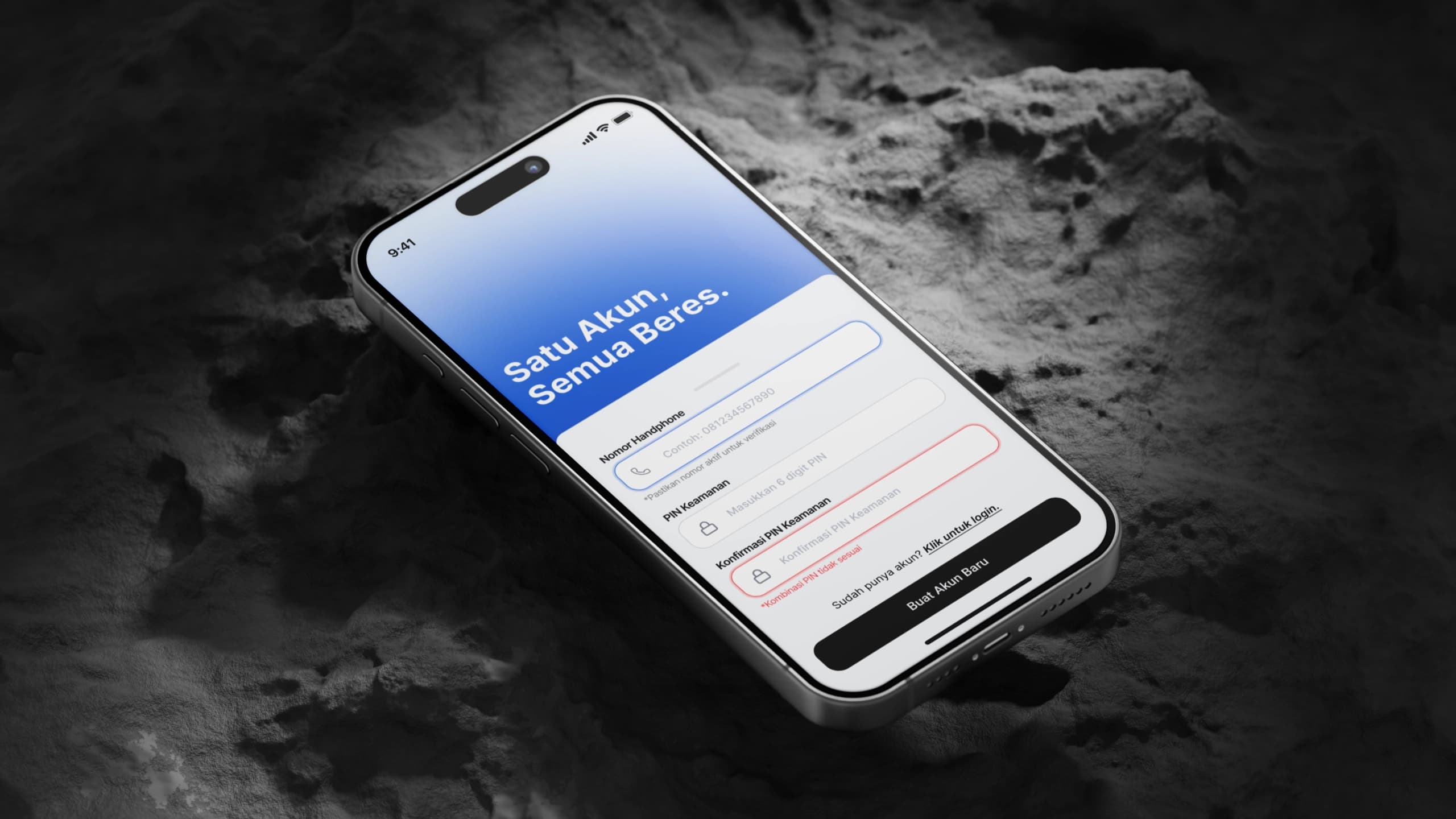
Rather than treating Figma as a static illustration canvas, I constructed the design system with the same structural discipline expected in production code. Every screen was built strictly with mobile-first constraints using nested Auto-Layout, responsive frame behaviors, and reusable component variants.
This meant components flexed naturally across different mobile viewport heights and aspect ratios, from compact devices to tall modern OLED screens. I standardized numerical typography for monetary amounts, defined high-contrast status pills for transaction states (pending, completed, reversed), and created accessible form input states with explicit validation cues. Building the system this way eliminated visual drift and ensured the development team had clean, predictable component specs during implementation.
The Connected Interactive Prototype
Static mockups often hide ergonomic flaws that only appear once an interface is held in human hands. To evaluate thumb reach, transition pacing, and spatial orientation, I linked every screen and modal into a fully interactive, clickable prototype directly inside Figma.
The prototype mapped complete user journeys: signing in, reviewing wallet balances, searching through transaction records, and stepping through a multi-stage money transfer flow with slide-up bottom sheets and security confirmation dialogs. Having an end-to-end clickable prototype allowed product stakeholders and mobile developers to test the physical feel of the app and validate interface ergonomics before writing frontend code.
Brief-Driven Iterations & Ergonomic Handoff
The design process ran on tight, structured iteration cycles. The client team supplied the core business requirements, security constraints, and feature briefs for each upcoming sprint, which I translated into visual workflows and modular screens.
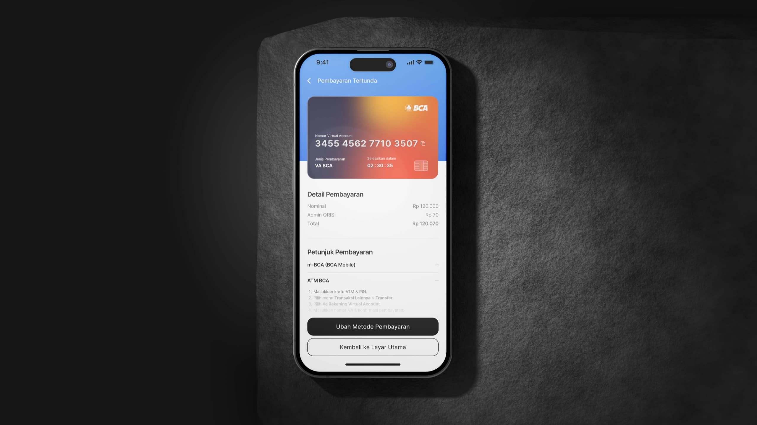
While the feature scope was guided by client requirements, I actively looked for user experience friction during drafting. When an onboarding flow felt overly dense or a payment confirmation lacked sufficient visual reassurance, I proactively proposed simplified alternatives that reduced cognitive load without compromising transaction security. At the end of the contract, the complete Figma workspace—including the component library, token guidelines, and connected prototypes—was handed over to their engineering team for production implementation.
Where it stands.
Delivered
- Complete mobile design system with Figma Auto-Layout tokens and component variants.
- User journeys covering onboarding, biometric login, wallets, transfers, and history.
- Fully connected, clickable Figma prototype mapping end-to-end transaction flows.
- Design specs and production handoff package delivered to the development team.
What remains
- Production frontend code and API implementation were managed by the client's internal mobile development team.